Sense+
Client
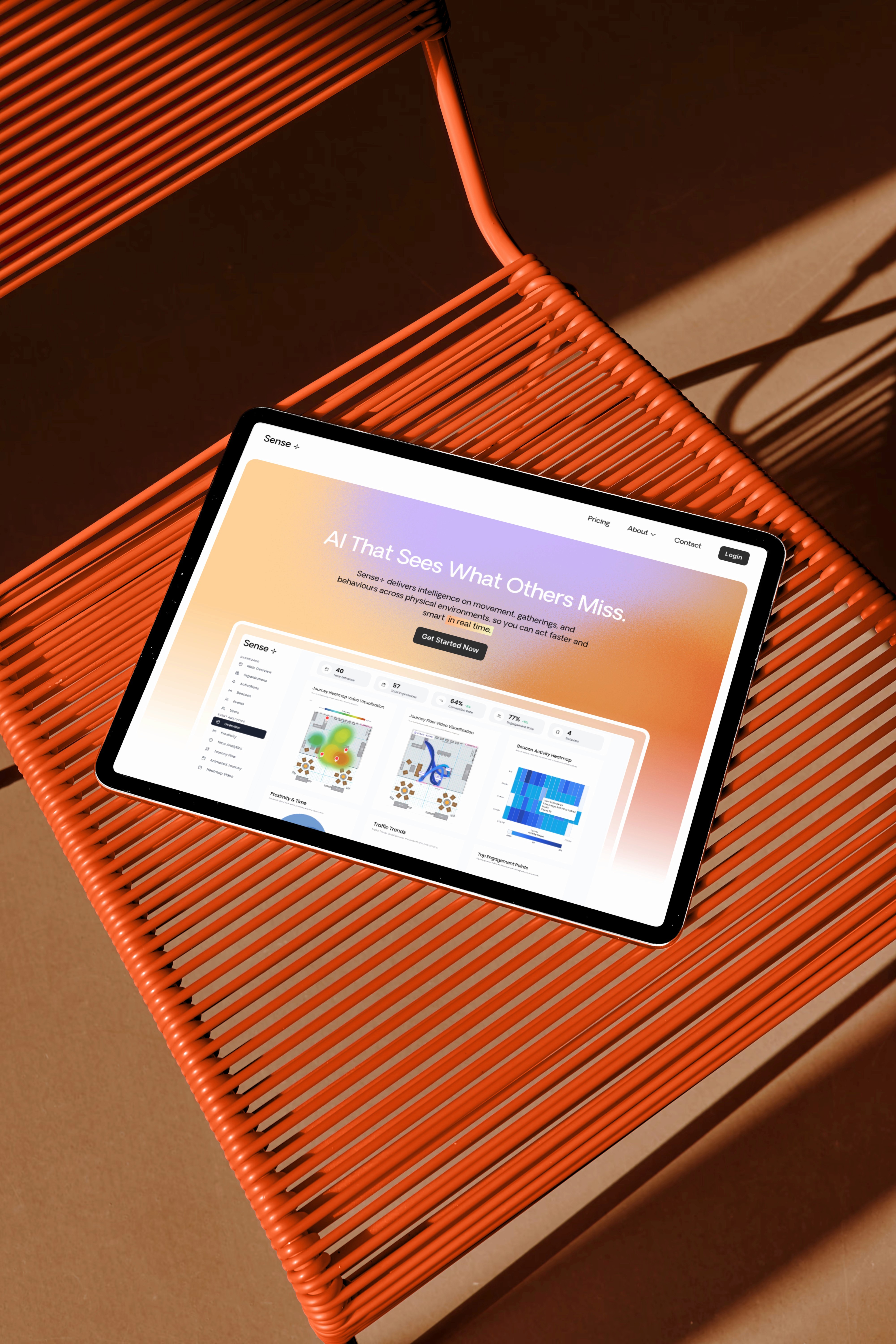
Sense+
Services
Web Development
Web Design
UX/UI Design
Year
2025
Description
Sense+ is an AI platform that helps founders automate workflows without code. I redesigned the entire website to remove friction, simplify the story, and make the product instantly clear. With a clean narrative, modular layouts, and subtle motion built in Framer, the new experience turns a complex product into something human, intuitive, and effortless to understand.


Frequently asked questions
How long does a project take?
Typically, a landing page takes 1–2 weeks, and a complete website 3–4 weeks, depending on scope. A clear timeline is always defined in the first call.
Do you only design in Framer?
Yes. Everything is built directly in Framer for speed and flexibility. Figma is only used for visuals or assets when needed.
What’s the difference between a landing page and a complete website?
A landing page is a single page focused on conversions. A complete website includes multiple pages, custom flows, and brand storytelling at scale.
What if I don’t know exactly what I need?
That’s what the consulting call is for. In 20 minutes we’ll uncover growth blockers and define the right direction for your project.
How do payments work?
All payments are processed securely through Whop. Pay with card, bank, crypto, or more. Whatever works best for you.
Can I update my website later?
Yes. Framer’s on-page editing makes updates effortless, so you can change text, visuals, or layouts straight from your browser. And if you ever need support, we’re here to help with new pages, improvements, or whatever keeps your site growing.
